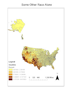
According to the Some Other Race Alone map, we see that a majority of these people who identify themselves in this very broad category to live mostly on the west and southwest and northwest regions of the U.S. Since this is such a broad category it is difficult to determine the reasons why these people live in these regions.
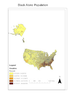
According to the Black only population we see a majority of people who categorize themselves as being Black only have highest concentrations in the southern United States and lower regions of the east coast. Black history in the U.S. can explain why a majority of these people live mainly in these regions.
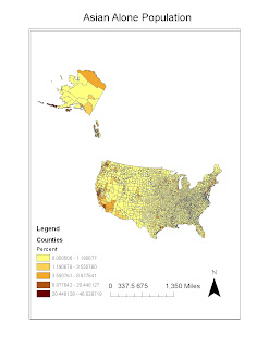
According to the Asian only population we can see that most people who categorize themselves as Asian only live mainly on the west coast of the United States and Hawaii. This is mainly due to these locations being closer to Asian countries and historical movements in the U.S.
My concluding consensus of these maps is that given historical backgrounds of many different ethnic groups across the U.S. we can see many different spatial and locational patterns. Many of these groups try to settle in regions that have identical climate or ideal climate or social factors that explain why people live in certain regions. My overall interpretation of GIS is that it is a very intriguing field. With time and practice I believe I could use GIS for many more subjects and other purposes. It is fun program to use when you know what to do but when you get lost or mess something up, these small problems can make the assignments and other related work hard to fix.
Thursday, May 27, 2010
Tuesday, May 25, 2010
Lab 7 station fire
The fire burned near the Angeles Crest Highway and threatened Mount Wilson Observatory. Mount Wilson Observatory houses several multi million dollar astronomical equipment by UCLA, USC, Berkeley, and Georgia State University.
The fire was quite severe in that it became the tenth largest fire in California's history. It is also the largest fire in the Los Angeles region. The fire threatened 12,000 structures in the National Forest and several neighborhoods around Los Angeles. The total cost of the fire was about $93.8 million and two firefighters lost their lives in the event of the fire.
After the fire was contained investigators were sent into to search for clues for what started the fire. After an in depth investigation it was determined that the cause of the fire was arson. Investigators found a substance they believed caused the fire.
Using GIS, we can look at the transportation routes, urbanized areas, and water resources to better address fires in the future. We could locate nearby water reserves and quick access points to reach future fires to contain them faster and cheaper.
Bibliography
1. "New fire breaks out near Angeles Crest Highway; forces road closure". Pasadena Star-News. August 26, 2009.May 26, 2010
2. "Firefighters Killed in 'Station Fire' Remembered". KTLA-TV(Channel 5). September 1, 2009. May 26, 2010
3. "Station Fire Evening Update Aug. 31, 2009". InciWeb(United States Forest Service). August 31, 2009. May 26, 2010
4. Winton, Richard (September 4, 2009). "Substance found near Station fire ignition point is key evidence in arson probe". Los Angeles Times. May 26, 2010
5. Station Fire Update Sept. 27, 2009. InciWeb. May 26, 2010
Tuesday, May 11, 2010
Week 6 Lab
Map Projections have severe significance when it comes to interpreting them. One thing to always remember is that maps all have distortions because we live on a spherical surface and not a flat one. As you can see from these map projections the distance between Washington D.C. and Kabul can be distorted giving a false distance.
The best approximate distance I could find using Google Earth is 6,925 miles. From the maps we see the distance shifts from as low as the 5,042 mile range to about 10,107 miles range resulting in about 5,000 miles worth of distortion when comparing the two extremes distances.
The maps that portrayed the most accurate distances were the equidistant maps. The maps that portrayed the largest amount of distance were the conformal maps and the cylindrical equal area map. Lastly, the maps that portrayed the shortest distance was the equidistant cylindrical map.
Map projections play an important role in deciding which region to study and they also play an important role in GIS to display features as accurately as possible. Lastly, having the right map projection is also very important for navigation, especially for pilots and boat captains so they know how far away something really is.
Week 7 Lab
The area of the following maps below represents the area of the transverse mountain ranges north of the Los Angeles metropolitan region. The extent of the maps coordinate system ranges from top 34.442 to bottom of 34.109 and from left of -117.865 to right -117.334. The decimal degree of the area.
A Shaded Relief Model
Tuesday, May 4, 2010
Week 4 Lab
I thought using ArcGIS was a unique and interesting experience. The tutorial was very helpful however there were several times in which I got lost or confused with the controls. I was able to figure out how to correct most of the mistakes I made but it was more time consuming than I originally thought.
Some problems I encountered with ArcGIS were mainly the control buttons. I kept having difficulties zooming in and out of the entire map when I was trying to focus on one of them. Another problem I encountered often was locating certain files because I stored the tutorial and files on my flash drive.
Some pitfalls of GIS are that it is a very in depth system which would require someone who is not just geographically oriented but very computer skilled too. People who do not know how to use computers that well will find a program such as ArcGIS very difficult. These difficulties however can be very beneficial to someone who is skilled in this program.
GIS offers massive potential for projects such as in the tutorial of city planning when considering noise from an airport. You can almost apply GIS to about anything. The difficulties I mentioned earlier could also be considered as potential for GIS by allowing a variety of customization tools for the GIS user. ArcGIS provides a massive amount of customization, which can give maps with a lot of information a little easier to understand once a map is completed.
Tuesday, April 20, 2010
Lab#3 Google Maps
View Tour of Sacramento Metropolitan Region in a larger map
Some
Some pitfalls of neogeography are an invasion of privacy and and the freedom to access this information. However, sometimes this information can be useful. For example, we have seen neogeography used in the location of stolen cars, laptops, and even locational services to locate sex offenders.
There is a lot of potential for neogeography especially in our computer information age. We can use neogeography for a lot of different services such as trip planning, flight tracking, and to locate retail stores we use everyday. But as always, the main consequence of neogeography is the invasion of privacy and who is allowed and what information should be made public.
Tuesday, April 6, 2010
Lab Week 2 Topographic Maps
1. The name of the quadrangle is Beverly Hills.
2. The names of the adjacent quadrangles are Canoga Park, Van Nuys, Burbank, Toponga, Hollywood, Venice, and Inglewood.
3. The quadrangle was first created in 1966
4. The North American Datum of 1927 was used to create this map.
5. The scale of the map is 1:24,000
6. A. 1/24,000 x 5m= 5/120,000, divide by 100 to convert to meters = 1200 meters
B. 1/24,000 x 5in = 5/120,000 in divide by 63,360 = 1.89 miles
C. 5,280 ft/ 1 mile x 12in/ 1 ft= 2.64 in
D 1/24,000 = d/3 km, d= .000125km, .000125km x 1000m/ 1 km x 100cm/ 1m= 12.5 cm
7. The Contour interval on the map is 20 feet
8. A. 34*04'26"N, 118*26'21"W
B. 34*00'27" N 118* 29' 59" W
C 34* 07' 13" N 118* 24' 36" W
9. A. 580 feet
B. 140 feet
C. Between 600 and 700 feet
10. The UTM zone of the map is zone 11
11. 3763,000 M North, 362,000 W
12. About 1,000 square meters are contained within each cell
13. 7.5 minute map line graph (y axis is in feet and x axis is the intersections)
14. The magnetic declination of the map is 14 degrees
15. The stream flows south towards the Los Angeles basin
16.
Tuesday, March 30, 2010
Three Maps
This map is from maps.unomaha.edu and it portrays population density by counties in the continental 48 states. I find this map interesting because it shows more detail of our population on regional and somewhat on a local scale as well with majority of our population residing on the east coast.
This map from the USGS and I like this map because it shows where most earthquakes have occurred in southern California. One thing in particular that I find interesting is that most earthquakes appear to have happened along the coasts or in the mountain ranges around southern California.
This map from flutrackers.com and I like this map because it shows where cases of H1N1 are most severe, in particular southern California because the majority of California's population reside there. I also find it interesting that most deaths from H1N1 have happened within the Los Angles basin all the way to San diego.
Subscribe to:
Posts (Atom)